In my latest case study on offering accompanying goodies and growing online order value, I used #Coach products as one of the examples.
While browsing Coach website, something caught my attention and left me confused.
📌Picture this: you’re on the item page, you like the item, and you want to buy it. You start looking for an “Add to Bag” or “Add to Cart” button, but you can’t find one.
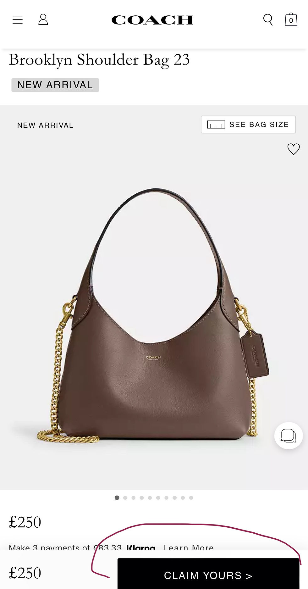
Instead, there’s a button that says 📌“Claim Yours,” which could mean:
Pre-Order: The product is available for pre-order before its official release.
Reservation: The product can be reserved in advance, possibly for limited-edition or high-demand items.
Special Offer: The product is part of a special promotion or deal that requires action to secure the offer etc.
However, the “Claim Yours” button leaves you confused rather than certain about what will happen next. It doesn’t clearly convey that the item will be added to the shopping cart for purchase.
I checked, and the item was indeed added to my shopping cart.
But is there room for creativity with the “Add to Cart” button? Probably not. While the shop could add a brief explanatory tooltip or secondary message like:
• “Claim Yours: Add to Cart”
• “Claim Yours Now—Buy Your Item Now”
- it risks overcomplicating the process with unnecessary creativity rather than providing clarity.
📌Seems like #Coach wasn’t satisfied with the performance either. A few days later, I checked again and saw the familiar “Add to Bag” button.

* My publication on types and examples of call-to-action messages on homepage and collection pages in #luxury #eCommerce may be found here.
🔗**I offer tailored e-commerce consultancy to ensure clarity and intuitive design. Details: